The basic idea was to find a balance between the thin, wispy sans-serif used to indicate a ‘futuristic‘ tone, and a bold, masculine font synonymous with ‘construction‘. We came up with something in the middle, leaning towards lighter-weighted fonts, but still with a hint of that blocky ‘construction’ vibe.
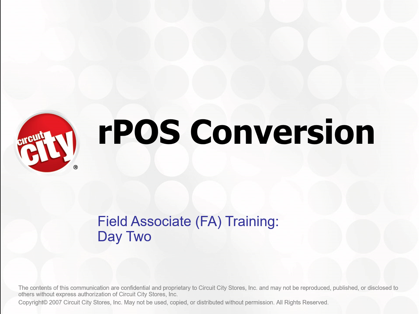
Design , Development , Implementation July 22, 2024 Circuit City rPOS Client Retail , Warehousing Category Curriculum Design , ILT , IMI Development Tools Content Producer , PowerPoint Start date 09/01/2006 End date 03/15/2008 Overview This project was to develop the training for the rollout if IBM’s rPOS point...
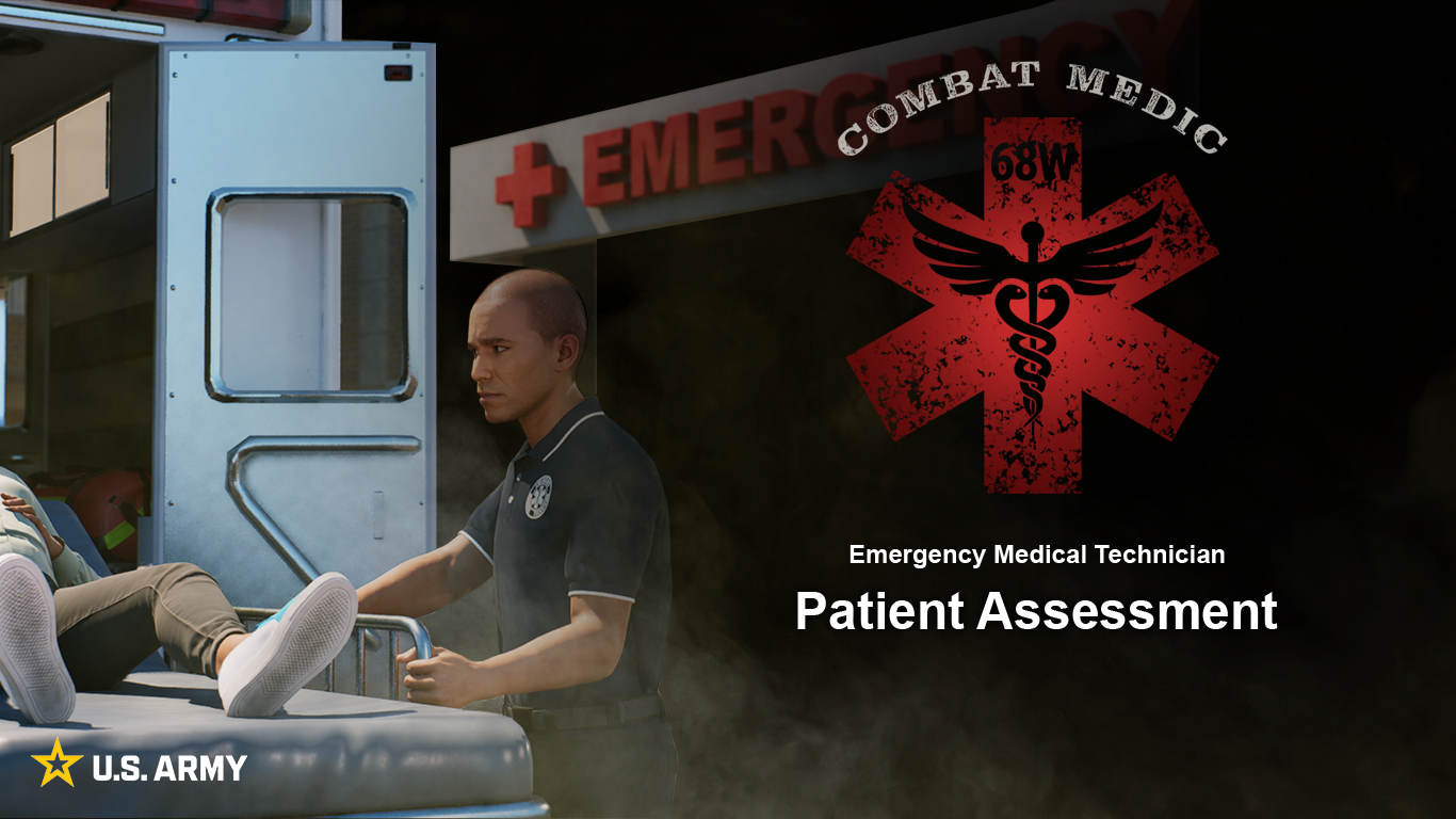
Development July 18, 2024 68W Combat Medic Client Army , Medic Category IMI Development Tools Audition , Captivate , JavaScript , Photoshop , Premiere Pro Start date 12/15/2023 End date 12/15/2024 Overview 68W Combat Medic was a large e-Learning development project for the U.S. Army with Tipping Point Solutions....
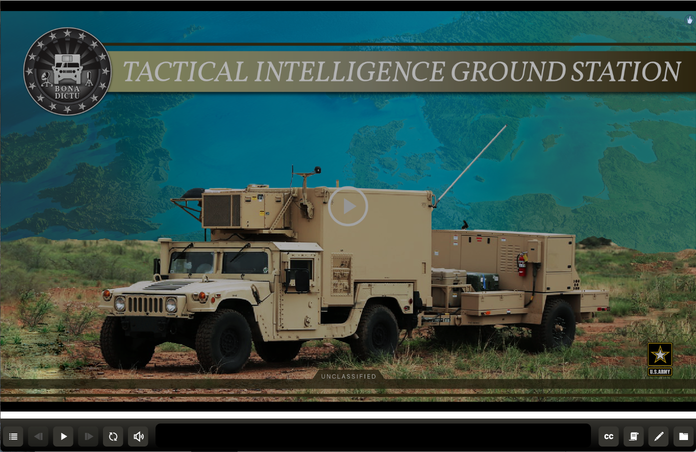
The basic idea was to find a balance between the thin, wispy sans-serif used to indicate a ‘futuristic‘ tone, and a bold, masculine font synonymous with ‘construction‘. We came up with something in the middle, leaning towards lighter-weighted fonts, but still with a hint of that blocky ‘construction’ vibe.